
By Leyya Sattar
Welcome to the final instalment of our public-speaking series. This week, we’re sharing tips on how to design your deck, and create an impactful presentation to engage your audience and make it memorable (and Instagram-able so people share your content!).
If you’re not design-minded, don’t worry. You don’t have to do it alone. Once you have a general idea of what you want to say - see last week’s blog on content for pointers on that - then you can get down a basic outline and enlist a design friend to whip it into a beautiful-looking presentation. That’s generally how Roshni and I work. She puts down the content, I turn it into an eye-catching deck. And these are the ten golden rules I tend to stick with.
1. Logistics
First things first, avoid unnecessary stress and make sure you check the details of the screen and sound setup with your event organiser and the venue.
Check the preferred format for the presentation - e.g. Keynote, Powerpoint or Google Slides
Can video and audio be played?
What is the preferred screen-size for the presentation e.g. wide-screen or standard size
Is the venue’s tech equipment compatible with your laptop? I.e. Do you need an adapter?
If you can’t share the presentation slides off your laptop, do they have the correct fonts installed?
2. Background design
I’d recommend staying away from existing template backgrounds or complicated images - keep it clean so people can focus on the content. If you do use an image, make sure there is a strong contrast between the text and the background. You want your message to stand out so if your content is competing with a busy background with lots of colour/busy scenes and other variations it can be overwhelming for people and difficult for people with visual impairments to focus on.


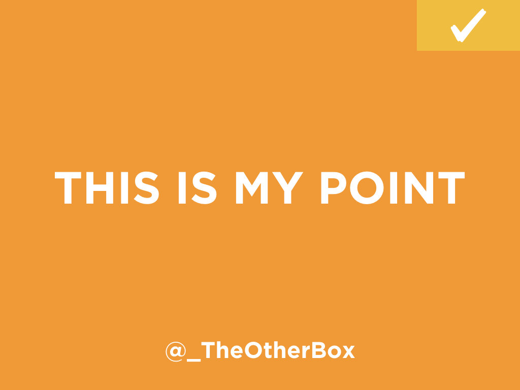
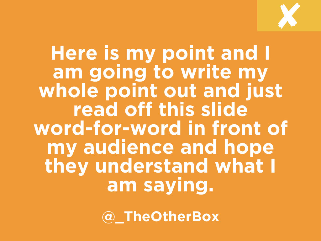
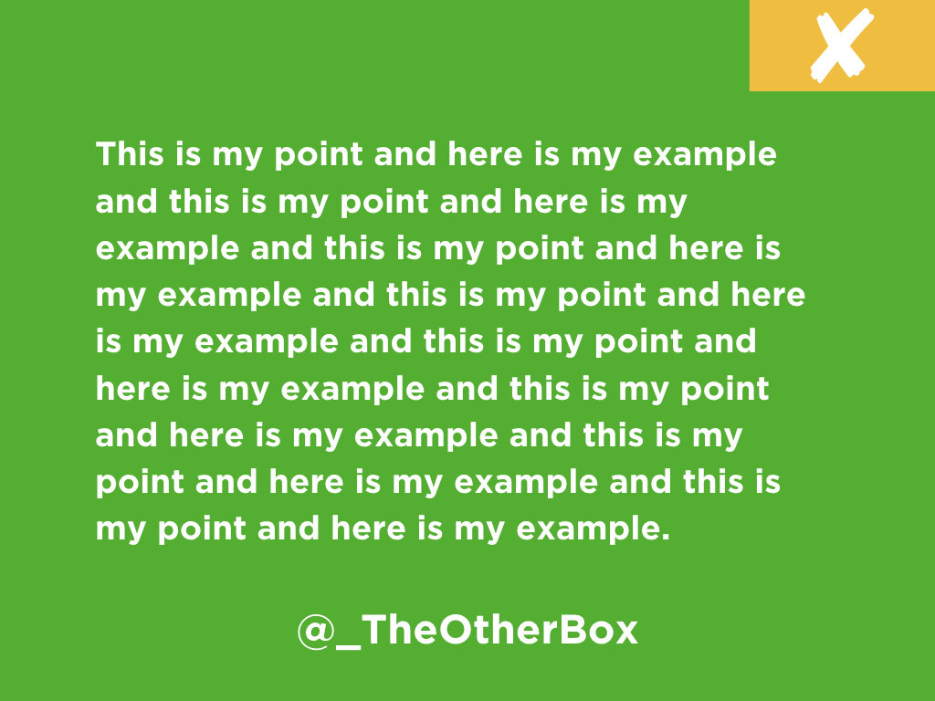
3. Don’t overcomplicate your point
If you pack too much information into your presentation, it will undermine its purpose as the audience has to process everything you say whilst looking at the slide. Your presentation is there to support your points - not explain them. If you do have a presentation with copy in, try to keep it to less than 6 words per slide. To avoid distracting people, we recommend giving people the time to read the information and then reading it yourself out loud for those who are listening but not watching.
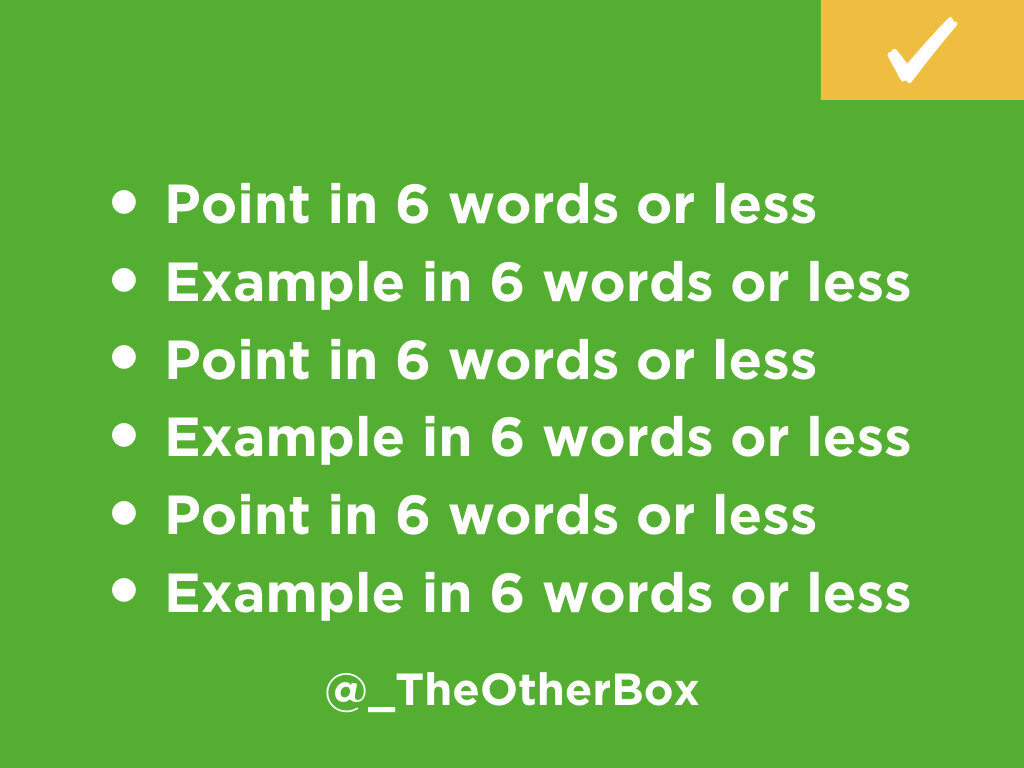
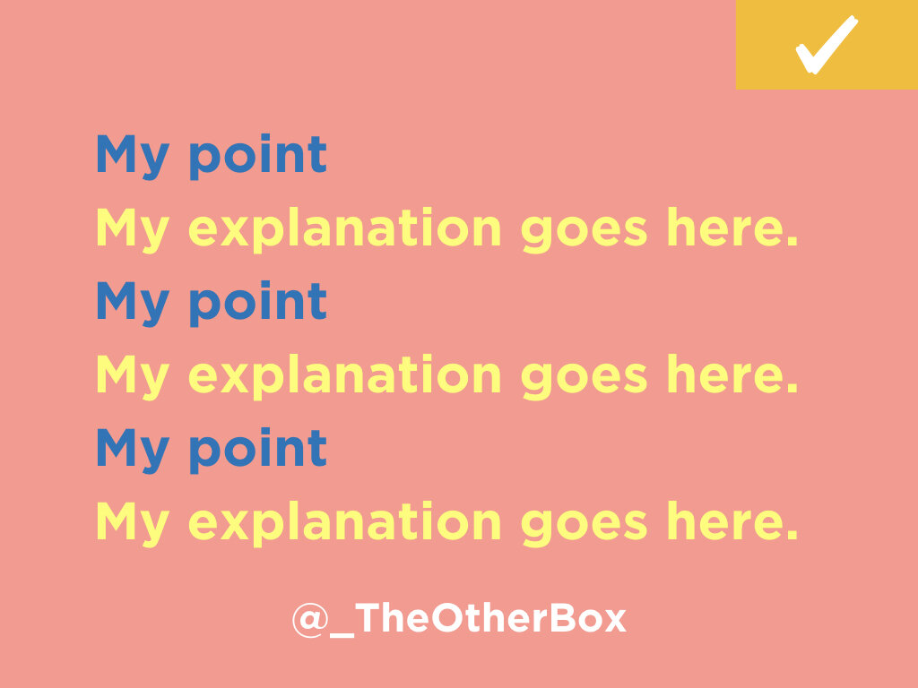
4. Bullet point lists vs. walls of text
A wall of text can be overwhelming to look at so if you have a long script and complicated content, a good exercise to break up your content and make your points more succinct is to bullet point using less than 6 words and then talk around it in further detail.
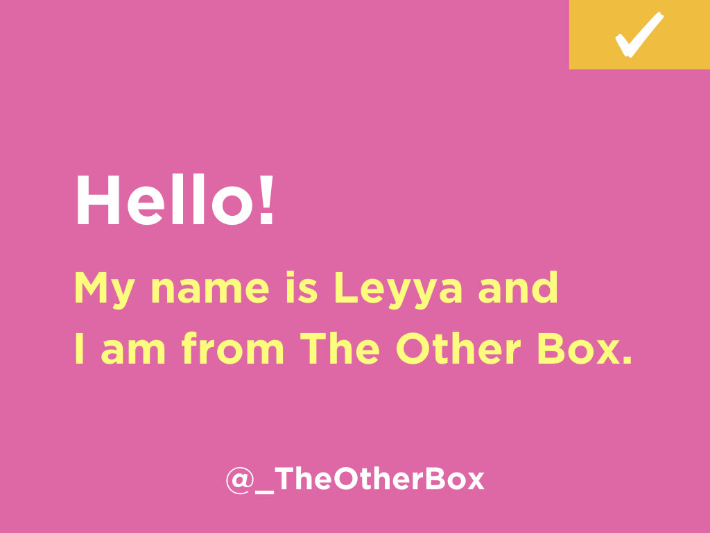
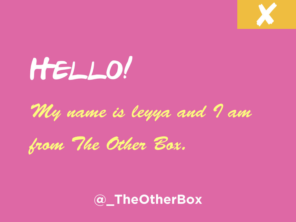
5. ‘Clean’ fonts
When it comes to typography, make sure it’s legible and easy to read for your audience no matter where they’re sitting. I’d recommend using fonts at 40+ point size - bigger the better!
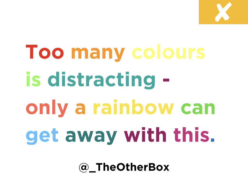
6. Keep your colour palette to 5 colours maximum
A complementary colour palette can enhance your entire presentation as well as emphasise your key points.
7. Use simple graphics to bring your content/data to life
Visuals and diagrams are a great way to support your message and enhance your key information.
8. Be consistent
Whatever design and style you choose to apply to your presentation, make sure the following is consistent across each slide:
colour palette
Typography
font size
logo placement
Other visual assets
9. Practice
As mentioned in our previous public speaking posts, rehearse your talk and practice with the slides to make sure you’re happy with the flow and any animations/transitions work properly.
10. Brand it!
Whether it’s your logo or social handle, make sure your name/logo is on each slide for when someone takes a picture and shares it.
————-
Thanks for tuning in to our 3-part series on Public Speaking Tips. Do you have any tips to add? Follow us @_TheOtherBox and share your pointers with us!